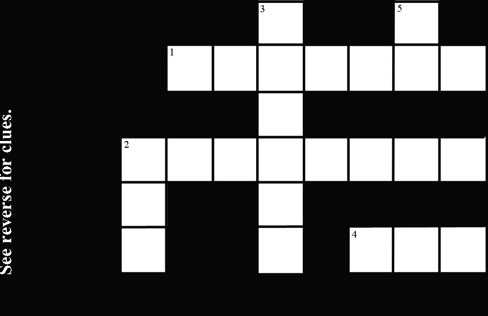
The main decision I am having difficulty with is whether or not to use a "traditional" style crossword typo.
On this design above - i kept this idea - though made the text a little larger.
Back / Clues:
This was my first "Back"

I don't really like "My Details" on this, but I kept the font the same - to suit the "traditional" style. These is my first clue style. I like how they work, though it has been pointed out to me that the numbers don't flow chronologically; yet it is the most effective design for passing my message.
Back 2:

I prefer the 'my details' here - though kept the clues the same.
Back 3:

This is a more conventional crossword style, I also changed the alignment of the clues to illustrate how if it was entirely "authentic" - how it would be.
My feelings here at that it kind of works visually, though it makes it slightly harder to get my message across easily.
The difficulty of the logistics of this idea is that I want the person to do it!! The clues and message has to be REALLY simple otherwise there is a risk that they just go ... Uuuurgh ... can't do it.
It is quite difficult to convey the message you want the user to decipher, while using clues that they will "easily" work out.
Some alternative clues are included on this one, and I feel they may work better.
I still think i will change 4 across to " a web abbreviation for company"
It's still a little difficult currently, but I'm still working on it.
The downside of this design is that I had to change 5 Down to "You want to Hire", rather than my preferred "The person you are going to hire" (for space reasons as u will see).
Overall, I prefer the clues at this stage. Though, while i like the 2 different columns for clues, it doesn't make the message to solve AS obvious?


I still prefer the "traditional" presentation (typo, I mean). Maybe I would just increase the weight or the size of it to make it more obvious or easy to find.
ReplyDeleteOr maybe use more space for your information (increase more the area in black, half or three quarters of your BC) and just leave a third for the answers. Remember the priority here is for people to have your contact details.